From 2013 Marine Cargo Bureau Far East provides survey services for shipowners, insurance companies, elements of the logistics market, banks and ship chartering companies.
The company is a branch of the network so the main task is to stand out from the head office and the website development was one of the essential parts of this task solution.
The company already had a website completed by 30% but the work with the previous contractor and the results didn’t satisfy the company so we became new people for the job. We presented the recommendations to edit and complete the current website as well as to create a new one.
As a result, the decision was to develop a new website and also to rebrand the logo.
As part of the logo rebranding, we developed three concepts and finalized the one which the client considered the most appropriate. We played around with fonts, colors and placement, provided the client with the source code so they could use it for the banding and printing later.
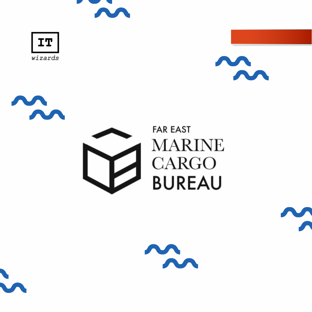
Rebranding concepts:
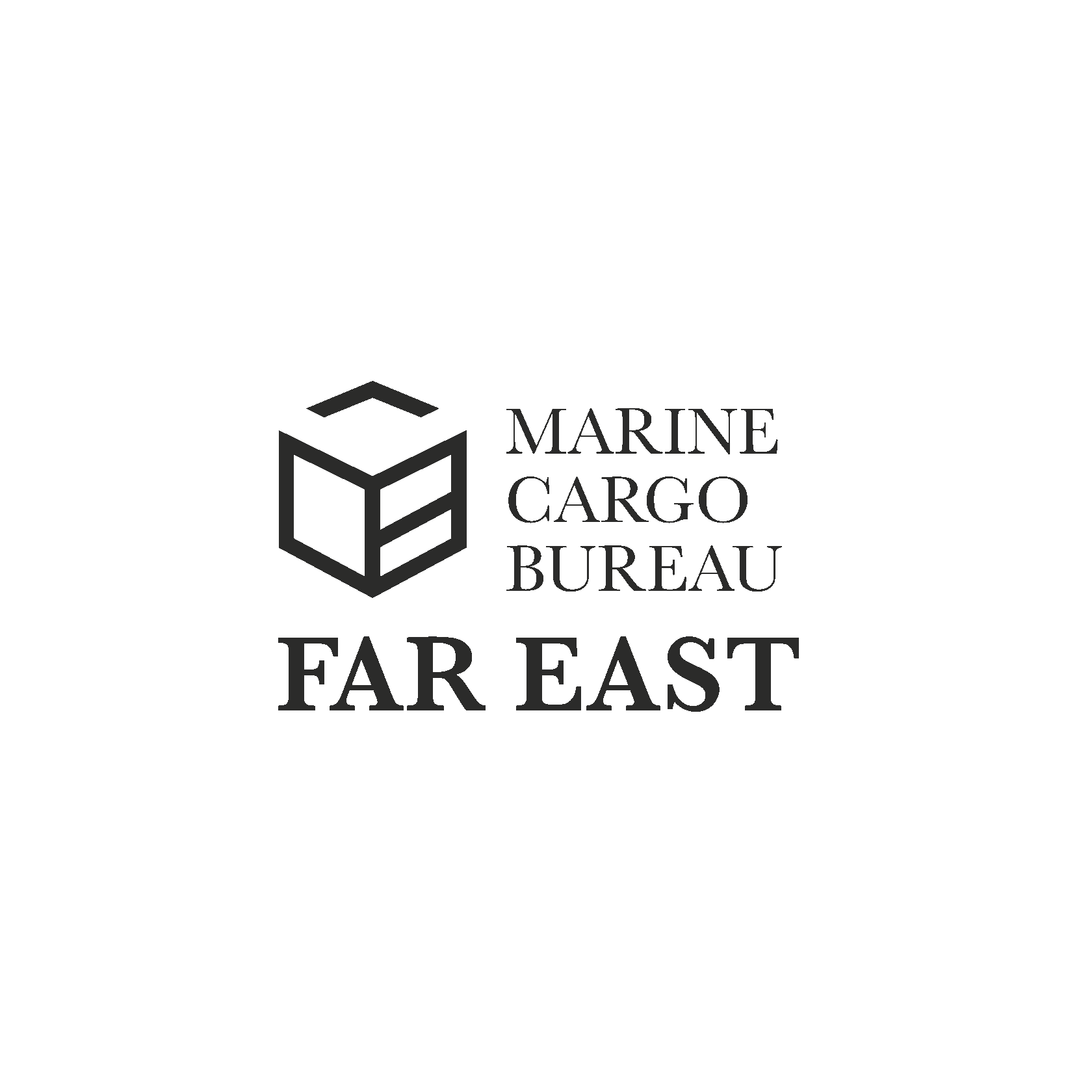
In the first version of the logo MARINE CARGO BUREAU the corporate style and sign was kept. The fonts were updated as well as the logo design placement.
For “MARINE CARGO” we used Baskerville font, a classic block font makes the logo look premium. We also used Futura font in the logo as its geometrical and sharp grotesque reflects the speed and accuracy.
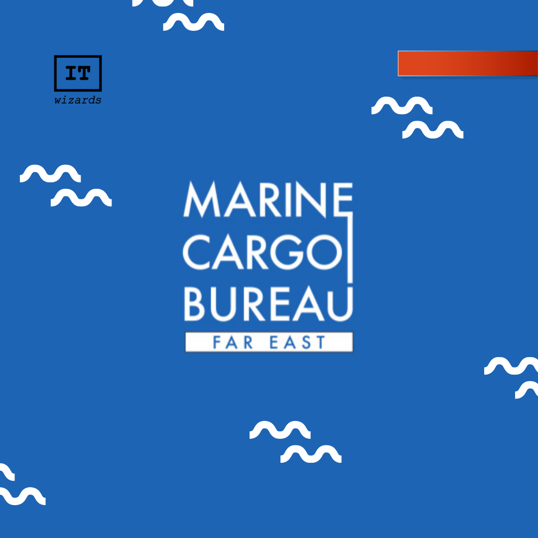
In the second logo version we decided to get rid of the corporate sign and create a squared font design which can be easily fit into any format for example on a website or a small icon.
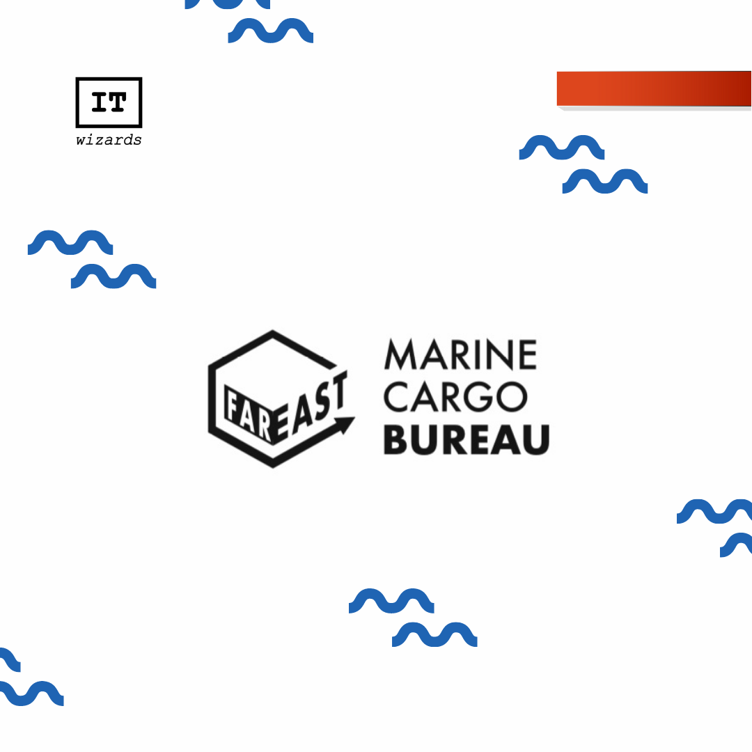
The final version: